
Role
Lead Product Designer
Project
Metric authoring and monitoring module of an enterprise ESG reporting platform
Context
Background
The name of the company has been omitted out of professional discretion. References below use generic terms ("the platform," "the company").
The platform is an enterprise ESG (Environmental, Social, Governance) reporting product. The company started as a consulting firm: in its original model, internal data analysts wrote each metric calculation by hand, first in YAML, then in Python. Clients had no visibility into how their numbers were produced. Over time, the strategic direction shifted toward a SaaS product where clients could increasingly own that work, with the consulting team available for complex cases.
”The challenge was not to simplify ESG reporting, but to make a powerful, technical tool usable by domain experts, who are not always data engineers.
The Product Suite
The platform is organized into five modules, each covering a stage of the ESG data lifecycle:

The five-module product suite, and how data flows through it.
- List Manager — defines reusable attribute values (countries, fuel types, sites) and their relationships. Used across the platform.
- Task Manager — organizes data collection campaigns with assignable tasks and roles (collector, verifier).
- Data Source — the central databases for raw ESG data, with a configurable schema. Populated manually, via Excel import, or through the Task Manager.
- Metrics — transforms raw data into reportable indicators through calculation chains. A Metric can consume Data Sources, other Metrics, or both.
- Publisher — builds visual indicators from Metric outputs and publishes them on a hosted client website.
Metrics in a Nutshell
A Metric transforms data from one or several input sources — a Data Source, another Metric, or both — into a calculated indicator. Metrics can be chained: one Metric’s output can become another Metric’s input. In practice, the platform’s data flow is a directed graph of calculations, and any single change in an upstream node can propagate through every downstream node.
The design challenge for this module was twofold: making those chains legible at a glance so users can trust what they read, and making metric authoring possible without code so users can do the work themselves, not just consume it.
My Role and Scope
As Lead Product Designer, I worked on nearly every module of the suite, to different degrees — some only briefly, others as a primary focus. The two I led most directly were Metrics, the subject of this case study, and Data Source, covered in a separate case study.
Across projects, I served as the interface between the in-house data analysts, the development team, and the Product Owner. I also worked in an advisory role with the other product designers (most of them senior), and mentored the team’s junior designer.
The Metrics module was built in continuous collaboration with the in-house data analysts. They were both the target user profile and a daily source of feedback. Understanding their actual workflow — what they look at, what they fear breaking, how they diagnose issues — shaped every decision in this module.
Metrics’ Visual Transparency
A calculation chain consists of multiple Metrics that depend on Data Sources or on other Metrics. When a single input develops a problem, the issue can propagate silently through every downstream Metric and corrupt the final indicators. Visual transparency is the system’s first line of defense: at every level of the product, a data analyst must be able to see what a Metric is, what it produces, and whether it can be trusted, without having to dig.
Concretely, this means four complementary layers. A grammar of icons that exposes status, lock state, and breaking changes wherever a Metric appears. A Metric page that surfaces the visualized result, the full metadata, and the raw output table in a single view. An index that lets analysts scan the health of every Metric at a glance. And a log that traces every change back to its origin, so when something does break, the root cause is recoverable.
The Four-Icon System
Every Metric, everywhere it appears in the product (index, Metric page, calculation pipeline, delete confirmation modal, any embedded reference) carries the same four icons next to its name, in the same order, expressing four independent dimensions.

Each Metric carries its four status icons, here across an entire calculation chain.
1. State 
These five states are mutually exclusive. A Metric is in exactly one of them at any moment.
- Up-to-date: Calculation has run, all upstream data is current
- Out-of-date: Upstream data changed; the Metric needs recalculation
- Update failed: A recent recalculation failed for technical reasons
- Updating: A calculation is currently in progress
- Invalid: The Metric cannot be calculated due to a structural break upstream
2. Auto-Update 
These two auto-update status are mutually exclusive. A Metric is in exactly one of them at any moment.
- Activated: The Metric recalculates automatically whenever an upstream change is detected
- Deactivated: The Metric is marked Out-of-date but does not recalculate on its own
3. Causes Breaking Changes 
A Metric “causes breaking changes” when it is producing output that will break Metrics or indicators downstream — typically because of missing attributes or values. A Metric can be Up-to-date and still cause breaking changes downstream; the two statements are not contradictory.
4. Lock 
Locked or unlocked. A data analyst can lock a Metric so that other users cannot modify it. This is a business safeguard against accidental edits that would propagate through the chain.
The Metric Index
A catalog of every Metric in the platform, grouped by Category and filterable by Locking, Categories, Labels, Units, Periods, Attributes, and Types. Archived Metrics can be hidden or shown via a toggle.
The four-icon system appears inline with each Metric name. Three hover interactions reveal additional information without requiring a click:

The index, where a hover reveals a Metric's status, its attributes, or what depends on it.
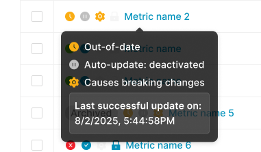
The status tooltip translates the four icons into plain language, down to the last successful update.
Hover on a Metric name
A tooltip surfaces the verbal status across all four dimensions (e.g. “Out-of-date / Auto-update deactivated / Causes breaking changes / Last successful update on 8/2/2025, 5:44:58 PM”).
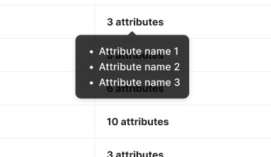
How is this Metric structured? The attributes hover answers without a click.
Hover on the “X attributes” column
The tooltip lists the attributes used by this Metric. The user learns what the Metric depends on without opening it.
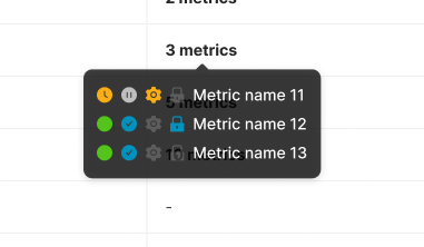
What depends on this Metric, and is any of it already broken? One hover answers both.
Hover on the “Used by other metrics” column
The tooltip lists the downstream Metrics that depend on this one, with their own state icons inline. This compresses impact analysis into a single hover: the user sees what a change here will affect, and which of those affected Metrics are already fragile.
The Metric Page
The Metric page was originally split into three tabs, each surfacing a different facet of the Metric. Working with the data analysts, it became clear that the tabbed structure was working against them: their daily task is to compare information across facets (the calculation, the output, the dependencies), and tabs forced them to lose sight of one zone the moment they opened another.
We consolidated everything into a single scrollable page, organized in zones of increasing detail. Scrolling proved faster and less mentally taxing than tab-switching, because the layout matches the way analysts actually read a Metric — top-down, with the ability to glance back up.

Everything about a Metric on a single page: overview, details, pipeline, methodology, and output.
Overview
Two KPI cards (current year, current month) with comparisons to the previous period, and a configurable chart for trend visualization.
Metric details
The metadata block: name, key (with a copy action), unit, period, attributes shown as pills, category, labels, creation and last-edit timestamps with authorship.
Calculation Pipeline
A horizontal visualization of the calculation chain centered on the current Metric. The user sees, without navigating, what feeds the Metric and what consumes it.
Description and Methodology
- A collapsible section containing two distinct blocks:
- Description — what the Metric measures, in plain language
- Methodology — how the calculation works and why this particular calculation was chosen
Output and Log tabs
- Output — the calculated data as a filterable, paginated table. The interaction conventions match the Data Source’s data view, intentionally, so users move between the two without re-learning.
- Log — the audit trail, detailed below.
The Metric Log
The Log is the audit and diagnostic layer of the Metric. Each event is a typed row with date, user (or system), and event label.
Filters apply on Date, User, Type, and Event. The event taxonomy is rich and color-coded with consistent iconography:

The Metric log: a typed, color-coded audit trail where breaking events stand out for fast diagnosis.
- Info events — process events: Sync started, Auto-update started, Created, etc.
- Success events — Up-to-date, Sync completed, Manual update completed
- Warning events — state transitions with consequences, such as Out-of-date or “Structure modified — Causing breaking changes”
- Structural events — Structure modified, Notebook modified
- Destructive events — Unlinked from Publisher (Breaking connections), and similar chain-breaking actions
The system distinguishes between human and automated actions. A system-initiated event includes a subtitle explaining the cause. The log is not just a record of user actions; it is a record of the Metric’s life.

Selecting a log event opens its full context: here, an export with its row count, format, and every applied filter.
Clicking an event opens a side detail panel with structured information about the event. The Export event, for example, displays the number of exported rows, the file type, and the filters that were applied at export time. The pattern matches the Data Source Activity Log, reinforcing the cross-module audit experience.
Deletion as Impact Analysis
Deleting a Metric is a high-consequence action because of the chain. The deletion modal is not a simple confirmation; it is an impact analysis screen.
This was a hard product requirement rather than a design innovation: the chain cannot be left unprotected. The contribution was in the execution — surfacing the downstream entities with their full state, splitting them by type, and reusing the same iconographic grammar as the rest of the product.

A delete confirmation that answers "what will this break?" rather than just "are you sure?"

Type-to-confirm: the final guardrail before an action that can't be undone.
- When the user initiates a deletion, the modal opens with:
- A clear warning header (“Delete the metric ‘Metric Name’?”)
- An explicit consequence statement (“This metric is connected to other elements. Deleting this metric will break the following connections:”)
- Two tabs with counters — Metrics (N) and Indicators (N) — separating the impacted entities by type
- For each impacted entity, the name and the current state icons (so a user about to delete a Metric used by an already-fragile downstream Metric sees that fragility before confirming)
- An irreversibility reminder (“This action can’t be undone.”)
- A two-step confirmation flow (Cancel / Next), not a single destructive button
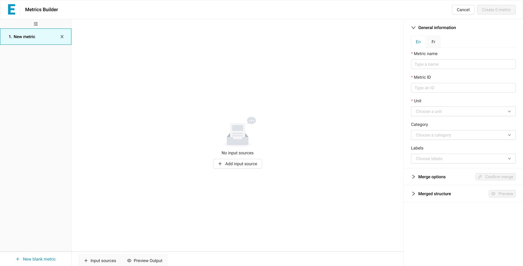
Building Metrics
The Metrics module is not only consulted, it is authored. How a Metric is built is itself a design problem, and arguably the most consequential one in the whole product: as long as Metrics could only be written by internal data analysts, the SaaS transition was structurally incomplete. Clients had to remain dependent on the consulting team for any meaningful change.
The authoring experience went through four paradigms: YAML files (rigid, opaque to anyone outside the team), Python scripts synced through Jupyter Notebooks (more expressive but still unreadable to clients), then the Metric Builder V1 and V2 — the no-code editors that finally opened authoring to clients themselves.
Metric Builder V1 — The First No-Code Editor
V1 was the first visual no-code editor. A data analyst (and, increasingly, a client) could define a Metric by manipulating attributes of a data source directly in the interface: remove an attribute to aggregate, choose an aggregation method per metric attribute, set a filter, configure period granularity. No YAML, no Python.
V1 covered the simple cases — most cases, in fact — but it had two structural limitations: a Metric could only be built from a single data source, and the user could not preview the result before creating the Metric.

No YAML, no Python: a Metric is built by manipulating attributes directly across three columns.
The User’s Mental Model
V1 lets the user perform the operations a data analyst would otherwise express in SQL or Python — select, project, drop, group, filter, aggregate — without exposing the syntax. The mental model is “I take a data source and I subtract or reorganize until I get what I want.”
Three-Column Architecture
V1 is organized in three columns.
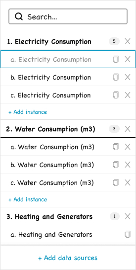
The list groups every chosen data source and its instances, the starting point of the build.
Left — The List
A vertical list of data sources, each expandable into multiple “instances.” Each instance is a Metric being authored from that data source. The user can build a whole family of Metrics from the same source in a single session: an instance for electricity consumption by site, another by country, another aggregated by quarter. The instances are numbered hierarchically (1, 2, 3 for data sources; a, b, c for instances) and the global “Create N metrics” button at the top right reflects the total count.
A copy action duplicates the current configuration of an instance, not the data source’s default state. An analyst can configure one Metric carefully and then fork variants from it, adjusting only the differences. This is the productivity feature that turns batch creation into rapid iteration.

Where the Metric gets its name, metadata and key.
Middle — Identify
The metadata of the currently selected instance: name, key, unit, category, labels, with a language toggle for bilingual metadata. The pattern matches the metadata block on the Metric page itself, so users move between authoring and consulting without re-learning.

Where the Metric takes its final shape: remove, add, reorder, or filter attributes, no code involved.
Right — Customize
The structural configuration of the Metric. Attributes inherited from the data source are organized in four groups:
- Period attributes — bound to the source’s periodicity. The user can aggregate up (monthly → yearly) but not refine down.
- Structure attributes — the descriptive dimensions (sites, countries, fuel types). Removing an attribute triggers aggregation on the metric attributes automatically.
- Metric attributes — the numerical columns. Each carries its own aggregation method (Sum, Average, etc.).
- Filters — attributes promoted into a filter slot, subsetting the data without changing the structure.
Limitations That Motivated V2
Two limitations remained:
- A Metric could only be built from one data source. Anything requiring data from two or more sources (a consumption value combined with a conversion factor, for instance) was still impossible without falling back to Python.
- The user only saw the result after creating the Metric. There was no in-builder preview, so configuration errors only became visible once committed.
Both were addressed in V2.
Metric Builder V2 — Multi-source authoring
V2 is a different paradigm from V1, but it was built under an explicit constraint: reuse as many V1 components as possible, both to preserve continuity for users already familiar with V1 and to keep the implementation effort manageable. V2 meets that constraint. The underlying model changes, but several patterns and UI components from V1 are carried over.

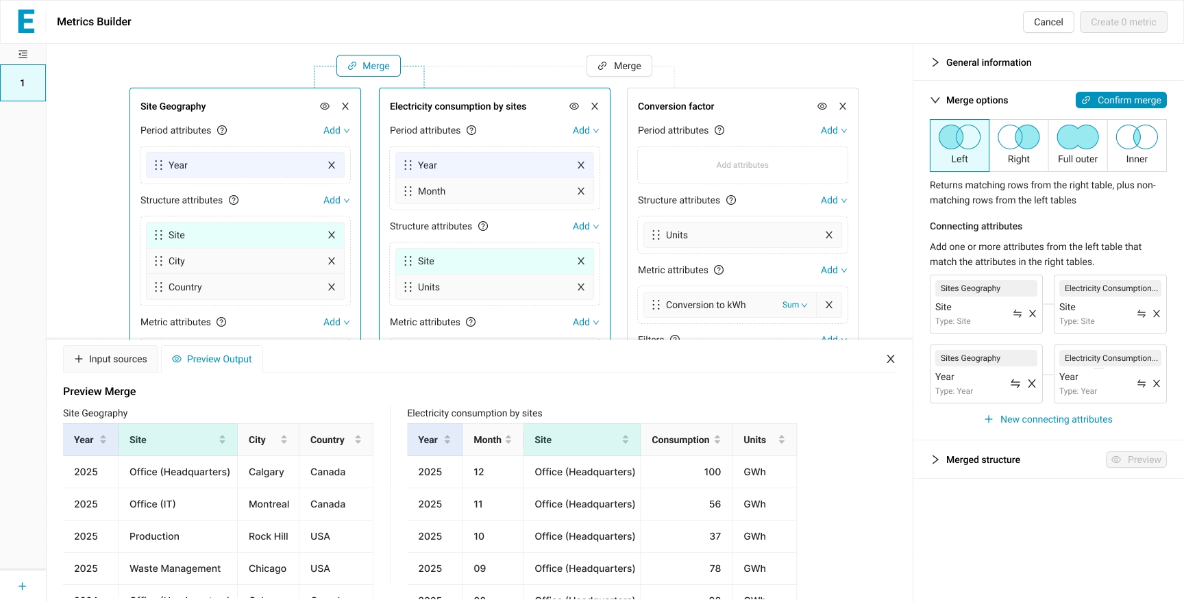
A Metric can now draw from multiple sources at once, each placed on the canvas and combinable with Merge.
Four Conceptual Shifts
- Multi-source. A Metric can consume any number of data sources and Metrics. The left-side panel of V1, which grouped instances under their parent data source, no longer makes sense; V2 replaces it with a flat list of Metrics being authored.
- Visual canvas. The center of the screen is a canvas where input sources appear as editable cards. Sources are no longer abstractions selected in a list; they are objects the user can see, modify, and combine.
- Merge as a first-class operation. Combining two sources requires an explicit Merge action with its own configuration. The merge has options, connecting attributes, and a confirmable state.
- Real-time preview. A Preview Output tab at the bottom of the canvas shows the actual data the Metric will produce, updated continuously as the user configures. V1 asked the user to configure first and discover the result afterwards. V2 makes the result visible while the configuration is still happening.
Adding Inputs
The Input Sources tab opens a picker beneath the canvas. Two sub-tabs separate Data Sources from Metrics, since a Metric can ingest either. The table presents source name, category, labels, and attribute count, with search and column sorting. Adding a source places its card onto the canvas; removing it is symmetric. The list and canvas update each other bidirectionally — the row in the picker shows “Remove” instead of “Add” when its source is on the canvas.
A blank canvas with one call to action: add the first input source.

The picker lists available sources, with Data Sources and Metrics on separate tabs.

The list and canvas stay in sync: add Site geography and its card appears, ready to edit.

Multiple sources side by side, each an editable card, joined by explicit Merge steps.
Merging Sources
Between any two adjacent source cards on the canvas, a Merge button appears. Clicking it opens the Merge options panel on the right.

The merge panel: pick a join type as a Venn diagram, then map the attributes that connect the two tables.
The Merge Panel
Four merge types are offered: Left, Right, Full Outer, Inner. Each is represented as a Venn diagram. The choice is the SQL JOIN logic exposed without SQL terminology. A short plain-language description accompanies the selected option (“Returns matching rows from the right table, plus non-matching rows from the left tables”), so the user is not asked to know the convention.
The system attempts to auto-detect matching attributes by name. The result is presented as pairs (Site ↔ Site, Year ↔ Year), each labeled with its type to prevent invalid joins. If the auto-detection is wrong or incomplete, the user can change the matching with a swap icon, remove a pair, or add a new connecting attribute. On the source cards, the attributes currently participating in a merge are highlighted, providing bidirectional feedback between the configuration panel and the canvas.
Before committing, a live preview shows both source tables and highlights the attributes being joined.
Preview Before Commit
A Preview Output tab shows the actual data of both source tables side by side before the merge is executed. The user verifies the inputs match expectations, then confirms.

Once confirmed, the merge produces one unified table, and stays reversible: a single Unmerge undoes it.
Confirmation and Reversibility
Confirming the merge updates the badge between the two cards from “Merge” to “Merged #1” with a check, and visually groups the merged cards in a single container. A new section appears in the right panel: “Merged #1 structure,” which is the structure produced by the merge — itself editable, with the same Period / Structure / Metric / Filters grouping as a source card. The merge is reversible via an Unmerge button.
Each source card on the canvas reuses the V1 Customize pattern: Period, Structure, Metric attributes, Filters, with the same drag handles, the same X buttons, the same Add affordances, the same per-attribute aggregation methods, the same iconography. The user does not learn a new vocabulary for what was already mastered.
Refining the Merged Structure

Right after merging, the full combined structure is editable attribute by attribute.

Remove attributes from the merged structure and the output re-aggregates live: fewer dimensions, summed values.
Once a merge is confirmed, the user manipulates the merged structure (not the original source cards) to shape the output. Removing an attribute from the merged Period or Structure triggers aggregation on the metric attributes, using each attribute’s pre-defined aggregation method. The Preview Output updates instantly to reflect the new grain.
Composability
A confirmed merge is not a terminal state. The “Merged #1” group becomes a virtual source that can itself be merged with another source, producing “Merged #2,” which can in turn be merged again. The full example flow in this case study chains two merges: Site Geography is first merged with Electricity Consumption by Sites (Merged #1), and that result is merged with Conversion Factor (Merged #2), at which point a calculated value normalizes consumption into kilowatt-hours.

A merged result can itself be merged: here, Merged #1 joins the Conversion factor source on Units.

Two merges deep: the output gains a Conversion to kWh column, and stays fully editable and reversible.
The composability is what makes V2 capable of expressing genuinely complex Metrics without introducing new patterns at each step. The user learns the merge interaction once and applies it as many times as needed.
Calculated Values
For arithmetic operations between attributes — for instance, multiplying a raw consumption value by a unit conversion factor — V2 introduces calculated values.

Beyond the merged attributes, "Calculated value" opens the door to authoring a new computed column.
Add Calculated Value
The “Add” action on Metric attributes opens a menu with two paths: re-adding an attribute that was previously removed, or creating a calculated value. Selecting the latter opens a calculation modal.

The calculation modal: pick a formula template, choose operands and operation, name the result. No code.
The Calculation Modal
The modal offers four templates as tabs: A + B, A + B + C, (A + B) × C, (A + B) × (C + D). The user picks the template that matches the shape of the calculation, then fills in the variables: each variable (A, B, C, D) is either an attribute from the merged structure or, via the “Use custom value” link, a literal constant. The operator between variables in the simple templates is chosen with radio buttons (+, −, ×, ÷).

Consumption times its conversion factor produces a new column, normalized to kWh for the whole table.
The Calculated Output
The calculated attribute is given a name; once confirmed, it becomes a regular metric attribute in the merged structure, available for further operations and aggregation.
What V2 Made Possible
By the time V2 reached its design-complete state, a client could, in principle, author a Metric that combined geographic data, raw consumption values, and conversion factors to produce a normalized indicator — entirely without code, entirely with visible intermediate results. The transition from consulting to SaaS, framed in the shared Context section, had a tangible end point in this work.
”The product's role is to surface the right information at the right moment for the domain expert they are, without assuming the technical fluency they often are not.
Design Principles
Three principles guided my work across both modules:
Transparency Over Magic
Users should always understand what the system is about to do, what it just did, and why. Hidden behavior in a data tool destroys trust.
Accompaniment, Not Hand-Holding
Our users are professionals (data analysts, sustainability managers) who know their domain. But “professional” does not mean “technical.” Many of them have no data analyst training, and very few have any programming background. The product’s role is therefore to surface the right information at the right moment for the domain expert they are, without assuming the technical fluency they often are not. For operations that would otherwise require code (building Metrics, for instance), this principle made a visual, no-code interface a requirement, not a preference.
Complexity is the Product, Not the Enemy
Reducing ESG complexity would reduce the product’s value. The design challenge is to make complex operations legible and controllable, not to flatten them.
Process and Collaboration
The principles above were applied across every project I worked on at the company. This section describes how that work was actually carried out.
Decision Making Process
Every significant design project followed the same pattern:
1. Technical Briefing with the Product Owner
The PO was an engineer with deep technical knowledge of how the platform worked. At the start of any project, I would sit down with them to understand the technical landscape: what was possible, what was constrained, what assumptions I should not make.
2. Research
Several parallel streams:
- Stakeholder interviews — 30 to 60 minutes each, with the people most knowledgeable about the problem at hand. For most Metrics work this was the in-house data analysts, but the same approach extended to anyone whose expertise was central to the project’s domain.
- Hands-on familiarity with the user’s tools — When the user’s work involved a technical skill I did not possess, I learned the basics myself. When designing for the Python-based Metrics, for instance, I learned enough Python to read and write simple scripts. The goal was not to become an engineer, but to experience the friction the user experienced rather than be told about it from the outside.
- Market and taxonomy research on similar products in the ESG and adjacent spaces. The focus was less on copying patterns and more on identifying which practice and terms were already familiar to data analysts in this market, so that the platform would adopt rather than reinvent them.
3. Initial Frame
Based on the technical context and the research, I drafted a first design.
4. Confrontation with the PO
The frame was reviewed against the technical reality. The goal was to be challenged on feasibility and on whether the design accurately addressed the problem.
5. User Testing
Primarily with the in-house data analysts, who were the actual target user profile. When relevant, the design was also tested with external clients.
6. Confrontation with the Developers
The developers were included throughout the project to flag any non-viable direction early — design that cannot be built is not design. But a dedicated implementation review came after the design was validated by users. By that point, the question was no longer “is this the right design?” but “how do we build it?”
Decisions such as the three-state import status taxonomy in the Excel Import flow, the per-attribute aggregation method (used in both modules), the cell-level error reporting, and the four-icon state system in Metrics all emerged from this process.
Working with Developers
A defining part of my role was staying close to implementation. For each task assigned to a developer:
- I sat with the developer at the start of the task to walk through the intent, the edge cases, and the rationale behind the design.
- The task was also fully documented in our tracker, so the verbal briefing was not the only reference.
- After the developer completed the task, a dedicated implementation review was scheduled, where we went through the built feature together and resolved any discrepancies.
This was particularly important because the team included junior developers. I treated the developer-designer relationship as a continuous loop, not as a handoff. The quality of the shipped product depended on it.