
Role
Lead Product Designer
Project
Data input and management module of an enterprise ESG reporting platform
Context
Background
The name of the company has been omitted out of professional discretion. References below use generic terms ("the platform," "the company").
The platform is an enterprise ESG (Environmental, Social, Governance) reporting product. The company started as a consulting firm: in its original model, the existing interface for entering and managing client data was rudimentary and not designed for self-service. Clients had little practical ability to feed or audit their own data, so internal analysts handled most of the work behind the scenes. Over time, the strategic direction shifted toward a SaaS product where clients could increasingly own that work, with the consulting team available for complex cases.
”The challenge was not to simplify ESG reporting, but to make a powerful, technical tool usable by domain experts, who are not always data engineers.
The Product Suite
The platform is organized into five modules, each covering a stage of the ESG data lifecycle:

The five-module product suite, and how data flows through it.
- List Manager — defines reusable attribute values (countries, fuel types, sites) and their relationships. Used across the platform.
- Task Manager — organizes data collection campaigns with assignable tasks and roles (collector, verifier).
- Data Source — the central databases for raw ESG data, with a configurable schema. Populated manually, via Excel import, or through the Task Manager.
- Metrics — transforms raw data into reportable indicators through calculation chains. A Metric can consume Data Sources, other Metrics, or both.
- Publisher — builds visual indicators from Metric outputs and publishes them on a hosted client website.
Data Sources in a Nutshell
A Data Source is the central database for a given set of ESG inputs — monthly electricity consumption per facility, headcount per department, emissions by source. Each Data Source has a configurable structure (no two clients use the same one) and can be populated through three channels: manual entry, Excel import, or the Task Manager.
In the original consulting model, building and managing Data Sources was a behind-the-scenes activity handled by the internal team. The design challenge for this module was to turn that activity into something domain experts could perform themselves, on data structures that vary radically from one client to the next.
My Role and Scope
As Lead Product Designer, I worked on nearly every module of the suite, to different degrees — some only briefly, others as a primary focus. The two I led most directly were Data Source, the subject of this case study, and Metrics, covered in a separate case study.
Across projects, I served as the interface between the in-house data analysts, the development team, and the Product Owner. I also worked in an advisory role with the other product designers (most of them senior), and mentored the team’s junior designer.
The Data Source module was built in continuous collaboration with the in-house data analysts. They were both the target user profile and a daily source of feedback. Understanding their actual workflow — what they look at, what they fear breaking, how they diagnose issues — shaped every decision in this module.
The Data Source page
The visuals shown in this case study are wireframes from the design process. The final interface was developed in close collaboration with the development team and refined through implementation reviews.
A Data Source page is organized in four sections: three that define and hold the data, plus an audit log.
General Information
The metadata layer: name, key, category, labels, collection settings, description. A persistent header surfaces the Data Source’s status (Ready, Connected, In Collection), the number of entries, and ownership context.

General Information: key information and metadata in one view.
Structure
The schema definition: which attributes make up each row of the database. Attributes can be linked to lists from the List Manager (e.g. a “Country” attribute backed by a pre-populated country list), or be free-form.
Structure can be created manually, imported from a structure file, or generated automatically by importing a full Data Source Excel file.
A business constraint that drove a key design decision: once a Data Source is connected to a Metric, its structure becomes locked. Modifying it would break downstream calculations. To change the structure, the user must first disconnect the dependent Metric. This rule is enforced visibly in the interface to protect data integrity.

A connected structure is locked: editing it would break downstream Metrics.

Structure edit mode: per-attribute types, requirements, and aggregation methods.
Data
The tabular view of the actual data. The design here had to support:

The Data tab: filtering, attribute icons, and configurable pagination.
- Variable column structures across Data Sources. We introduced a consistent iconography (calendar for date attributes, pin for location, stacked layers for list-backed attributes, sort for numeric attributes) so users can read any Data Source’s structure at a glance.
- Required vs optional attributes, marked with red asterisks in column headers.
- Multi-attribute filtering, with up to five filter chips visible at once and a “More Filters” affordance for additional ones.
- An explicit `Allow duplicates` toggle. Some clients have datasets where duplicates are legitimate (multiple entries for the same period-location-attribute combination); others do not. Rather than impose a default, we made this a business choice exposed at the Data Source level.
- Bulk selection and inline row management (manual entry, edit, delete).
- Configurable pagination (10, 20, 50, 100 rows) for working with large datasets.
Activity Log
ESG data is auditable by nature: clients use it to feed regulatory reports, so traceability is non-negotiable. The Activity Log captures every change to a Data Source — additions, modifications, deletions, imports, and failed imports.
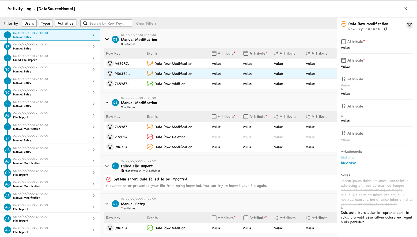
The Activity Log: timeline, grouped events, and before-after detail in three panels.
The screen is built around three panels:
Left: a chronological timeline of all events, with avatars and event types
Center: events grouped by session, with the affected rows and a color-coded event type (blue for modification, green for addition, red for deletion or system errors)
Right: a detail panel that opens when an event is selected, showing each attribute’s value before → after with vertical arrows, plus attachments and notes
Filters allow scoping by user, event type, activity type, and row key.
A specific design decision worth noting: failed imports are not represented as a generic error. They appear with a clear status, a plain-language explanation (“A system error prevented your file from being imported.”), and a next-step suggestion (“You can try to import your file again.”). The log is not just a record; it is a tool for resolving issues.
Deep Dive: The Excel Import Flow
The Excel import is the most complex flow in the Data Source module. It is also where the three design principles had to be applied in their strongest form.
Framing
Most users importing an Excel file know roughly what they are doing. They understand that the file’s structure should match the Data Source’s structure. But many things can go wrong: column name mismatches, missing required values, wrong data types, internal duplicates, conflicts with existing data, and concurrent imports by other users on the same Data Source.
The import flow is designed to walk the user step by step through this complexity, surfacing every possible issue before the data is committed.
Step 1 — Import Method and Upload
The user makes two decisions on this screen.
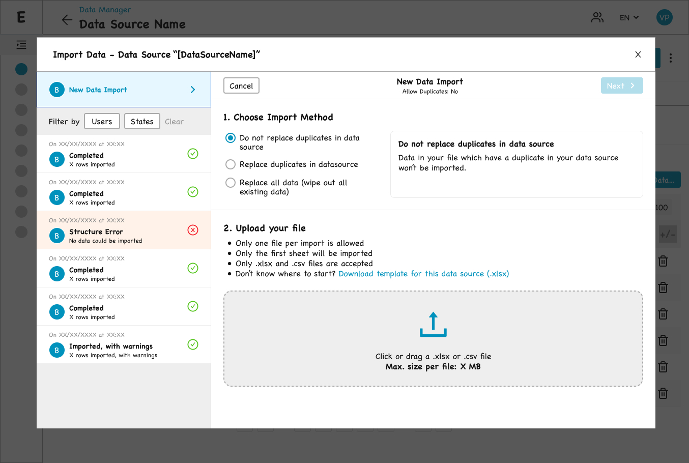
Step 1 — import method and upload, with constraints stated up front.
Import history: three statuses, because partial success is a real outcome.
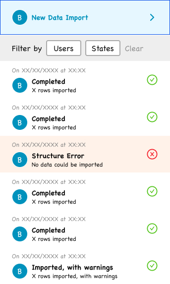
Import History
A side panel lists the user’s previous imports for this Data Source, with statuses ranging from:
- Completed (green check)
- Structure Error (red X, “No data could be imported”)
- Imported, with warnings (green check, “X rows imported, with warnings”)
The status taxonomy was deliberately three-state rather than binary success/failure, because partial success is a real and recurring outcome that deserves its own status.
The selected method explains itself in plain language, right beside the choice.
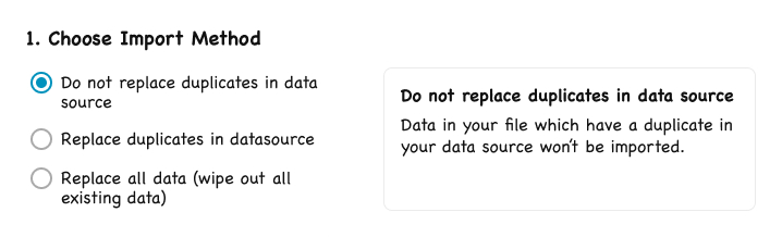
1. Import Method
Three radio options:
- Do not replace duplicates in data source
- Replace duplicates in data source
- Replace all data (wipe out all existing data)
A contextual help panel on the right updates with a plain-language description of the selected option. Pedagogy is embedded in the interface, not hidden behind tooltips.

Constraints are stated up front, and a pre-generated template removes the top cause of failed imports.
2. File Upload
A drop zone for `.xlsx` or `.csv` files, with all constraints stated explicitly above the zone:
- Only one file per import is allowed
- Only the first sheet will be imported
- Only `.xlsx` and `.csv` files are accepted
A key affordance, suggested by the Data Analyst team and integrated into the flow: a “Download template for this Data Source (.xlsx)” link. The template is pre-generated with the exact structure of the target Data Source, removing the single most common cause of failed imports.
Step 2 — Structure Mapping
This step only appears when the system cannot fully resolve the mapping between the file’s columns and the Data Source’s attributes automatically (the back-end attempts matching on column name similarity).
A warning banner reminds the user to verify the mapping (“Please check the mapping between your file and the data source’s structure”). The downloadable template link is re-surfaced (“Not sure what is going wrong? Download template for this data source.”) as a fallback for users who realize their file structure needs to be rebuilt
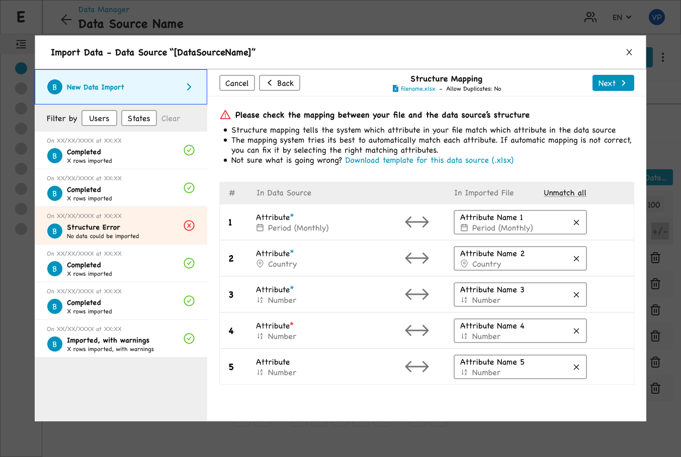
Step 2 — mapping file columns to the Data Source, when auto-matching needs a human check.
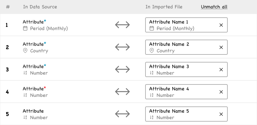
Each pair can be unmatched individually, with attribute icons carried over from the Data view.
The screen presents a two-column mapping table: “In Data Source” on the left, “In Imported File” on the right, connected by a bidirectional arrow. The same attribute icons from the Data section are reused here, maintaining visual consistency across the product.
Step 3 — Duplicates and Aggregation
If the user’s file contains internally duplicated rows (and the user did not allow duplicates), this step asks how to merge them.
The rules for non-numerical attributes are stated explicitly in the screen’s introduction, so the user knows what will happen to text and date columns without having to discover it by trial and error.

Step 3 — each numeric attribute gets its own aggregation method, because summing and averaging are not interchangeable.
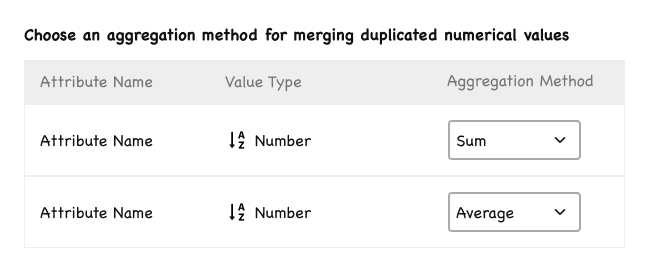
One attribute sums, another averages: the per-attribute choice that keeps ESG data correct.
The design decision here was to allow per-attribute aggregation methods. A single global aggregation would have broken the product: in ESG data, summing electricity consumption is correct, but averaging a gender ratio is correct. Each numeric attribute can be assigned its own aggregation method (Sum, Average, etc.), and “None” is offered as a valid choice (keep the first row, discard the others).
Step 4 — File Analysis Report
This is where the import becomes transparent before it commits. This pre-import preview is essential because of concurrency: another data analyst may be importing into the same Data Source simultaneously (the back-end uses a queue). The preview gives the user a clear snapshot of the current state and what their import will do against it.
The screen shows what will happen if the user clicks “Import,” broken into four sections:
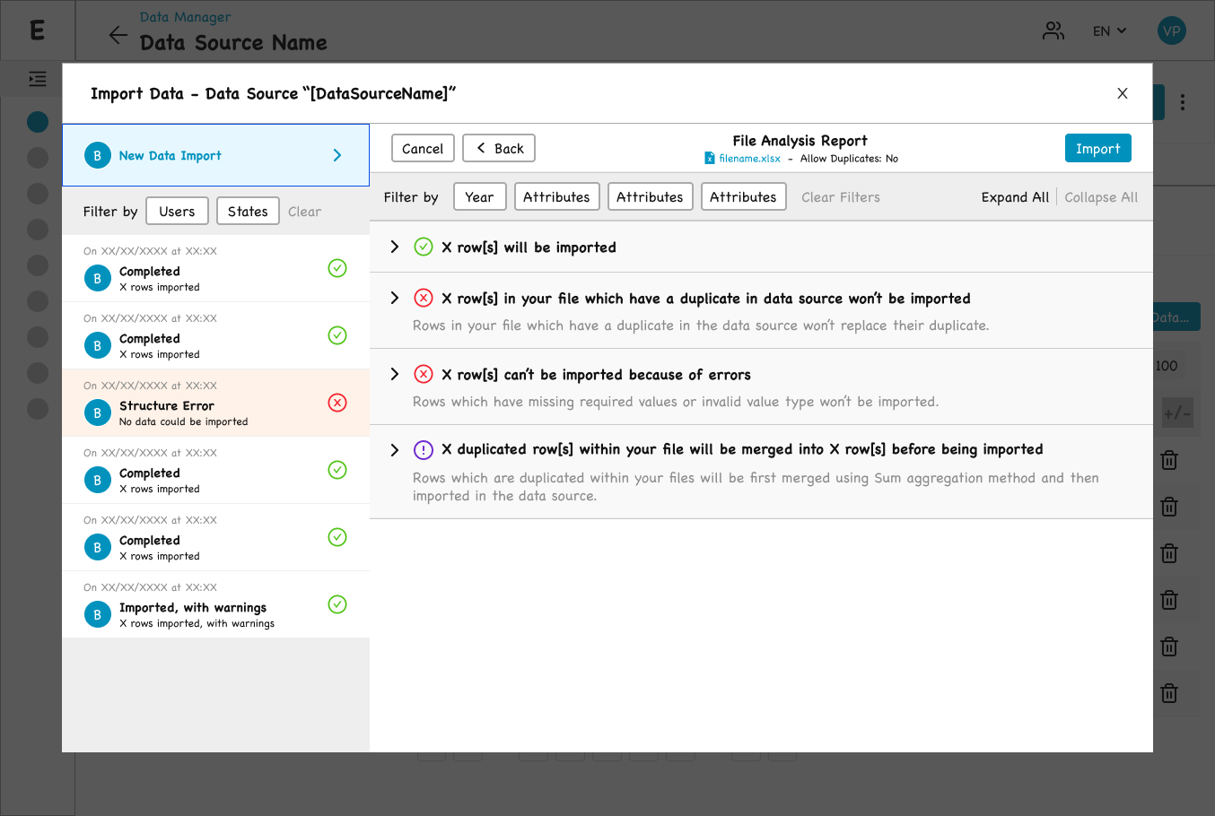
Step 4 — a full preview of what the import will do, before a single row is committed.

The four-section preview spells out every outcome in plain language before you commit.
- Green check: X rows will be imported
- Red X: X rows in your file which have a duplicate in data source won’t be imported
- Red X: X rows can’t be imported because of errors
- Purple warning: X duplicated rows within your file will be merged into X rows before being imported
Step 5 — Data Import Summary
The post-import view uses the same four sections as Step 4, with only the verb tenses changed (future tense → past tense). This was a deliberate decision: the user has already learned the structure of the report on Step 4, so seeing the same layout after the import minimizes cognitive load. The continuity also makes any divergence between expected and actual outcomes immediately visible — a useful property given that concurrent imports can cause that divergence.
The summary is dated, attributed to its author, and tied to the imported filename.

Step 5 — shown after the data has been imported, the summary mirrors Step 4 to minimize re-learning.
The Detailed Report

Expanded, the report pinpoints errors cell by cell and shows the before-and-after of every merge.
For rows to be imported: the actual rows are previewed in a table, with required attributes flagged. Hovering an attribute header reveals its key information (required, data type, description).
For excluded duplicates: rows are shown with a light red background, indicating they will be discarded.
For row-level errors: errors are pinpointed at the cell level, not at the row level. An empty required cell appears as a red-bordered empty box. An invalid value appears in red. A wrong-type value (e.g. a number where text is expected) is highlighted in its cell. The user knows exactly which cell to fix in their file.
For merged duplicates: the design shows the before and after of each merge. The duplicated rows are listed in a first table, then an arrow “→ Merged into” leads to the resulting row, with merged numerical values displayed in green to surface what the aggregation produced. Two cases are distinguished: “Merged into (and won’t be imported because a duplicate exists in data source)” and “Merged into (and will be imported)”. Edge cases are not buried; they are made legible.
”The product's role is to surface the right information at the right moment for the domain expert they are, without assuming the technical fluency they often are not.
Design Principles
Three principles guided my work across both modules:
Transparency Over Magic
Users should always understand what the system is about to do, what it just did, and why. Hidden behavior in a data tool destroys trust.
Accompaniment, Not Hand-Holding
Our users are professionals (data analysts, sustainability managers) who know their domain. But “professional” does not mean “technical.” Many of them have no data analyst training, and very few have any programming background. The product’s role is therefore to surface the right information at the right moment for the domain expert they are, without assuming the technical fluency they often are not. For operations that would otherwise require code (building Metrics, for instance), this principle made a visual, no-code interface a requirement, not a preference.
Complexity is the Product, Not the Enemy
Reducing ESG complexity would reduce the product’s value. The design challenge is to make complex operations legible and controllable, not to flatten them.
Process and Collaboration
The principles above were applied across every project I worked on at the company. This section describes how that work was actually carried out.
Decision Making Process
Every significant design project followed the same pattern:
1. Technical Briefing with the Product Owner
The PO was an engineer with deep technical knowledge of how the platform worked. At the start of any project, I would sit down with them to understand the technical landscape: what was possible, what was constrained, what assumptions I should not make.
2. Research
Several parallel streams:
- Stakeholder interviews — 30 to 60 minutes each, with the people most knowledgeable about the problem at hand. For most Metrics work this was the in-house data analysts, but the same approach extended to anyone whose expertise was central to the project’s domain.
- Hands-on familiarity with the user’s tools — When the user’s work involved a technical skill I did not possess, I learned the basics myself. When designing for the Python-based Metrics, for instance, I learned enough Python to read and write simple scripts. The goal was not to become an engineer, but to experience the friction the user experienced rather than be told about it from the outside.
- Market and taxonomy research on similar products in the ESG and adjacent spaces. The focus was less on copying patterns and more on identifying which practice and terms were already familiar to data analysts in this market, so that the platform would adopt rather than reinvent them.
3. Initial Frame
Based on the technical context and the research, I drafted a first design.
4. Confrontation with the PO
The frame was reviewed against the technical reality. The goal was to be challenged on feasibility and on whether the design accurately addressed the problem.
5. User Testing
Primarily with the in-house data analysts, who were the actual target user profile. When relevant, the design was also tested with external clients.
6. Confrontation with the Developers
The developers were included throughout the project to flag any non-viable direction early — design that cannot be built is not design. But a dedicated implementation review came after the design was validated by users. By that point, the question was no longer “is this the right design?” but “how do we build it?”
Decisions such as the three-state import status taxonomy in the Excel Import flow, the per-attribute aggregation method (used in both modules), the cell-level error reporting, and the four-icon state system in Metrics all emerged from this process.
Working with Developers
A defining part of my role was staying close to implementation. For each task assigned to a developer:
- I sat with the developer at the start of the task to walk through the intent, the edge cases, and the rationale behind the design.
- The task was also fully documented in our tracker, so the verbal briefing was not the only reference.
- After the developer completed the task, a dedicated implementation review was scheduled, where we went through the built feature together and resolved any discrepancies.
This was particularly important because the team included junior developers. I treated the developer-designer relationship as a continuous loop, not as a handoff. The quality of the shipped product depended on it.