
Role
Product Designer (self-initiated)
Project
A multi-side iOS app
Duration
~3 weeks
Context
Why Medsbuddy
I have been the remote caregiver of an elderly relative, and anyone who has done it knows the feeling. You are hundreds of miles away, you love this person, and you spend your days half wondering whether they took the right pill at the right time. Real peace of mind is almost impossible to get when you cannot be in the room.
That is the problem MedsBuddy is built around: let an elderly, low-tech patient follow a complex, constantly changing medication regimen correctly with almost no effort, while a remote family caregiver finally gets visibility and some peace of mind.
”Let an elderly patient follow a complex medication regimen correctly, while a remote family caregiver finally gets some peace of mind.
An AI-Augmented Project
MedsBuddy is a self-initiated concept, and it was also the testbed I used to build an AI design pipeline. At a high level, the pipeline is a set of specialized AI agents I built in Claude Code, one per role of a product design team, together covering every phase of design thinking, from the raw brief to the finished screens:
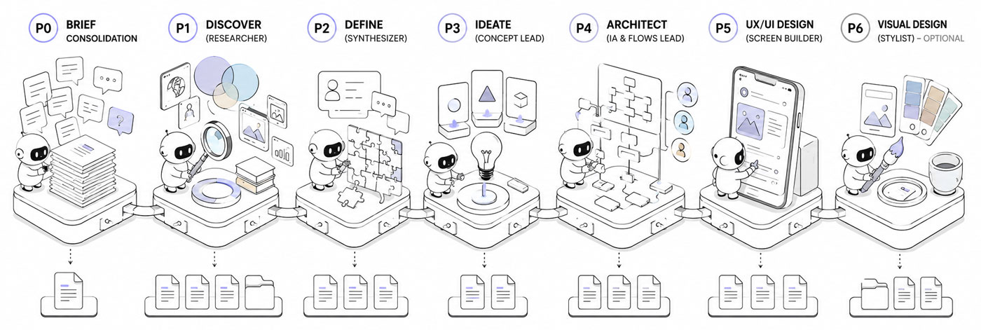
The pipeline as a relay of specialized agents, from a raw brief to finished design.
- A brief lead who digests the client material
- A researcher (discover) who builds the knowledge base
- A synthesizer (define) who reframes the problem
- A concept lead (ideate) who diverges into several directions, then converges on one
- An architect who lays out the flows and structure
- A UX designer (prototype) who translates the flows into screens
- An optional visual designer who applies the art direction
How it actually works, where it helped and where it broke, is a separate case study. This page is about the product it produced.
The Process
Starting from a brief
To run this like a real engagement rather than a solo daydream, I invented a client and the raw material a client actually hands you. The client is Mark, a non-technical first-time founder. His 79-year-old mother, Margaret, had a stroke and is now on nine medications. Some are taken twice a day, several have timing rules, and her cardiologist keeps adjusting the regimen from a distance.
I generated the raw intake myself, a kickoff interview and a follow-up call, the way a real one sounds, messy and incomplete. That transcript, not a tidy spec, is where everything started.
That transcript, not a tidy spec, is where everything started.
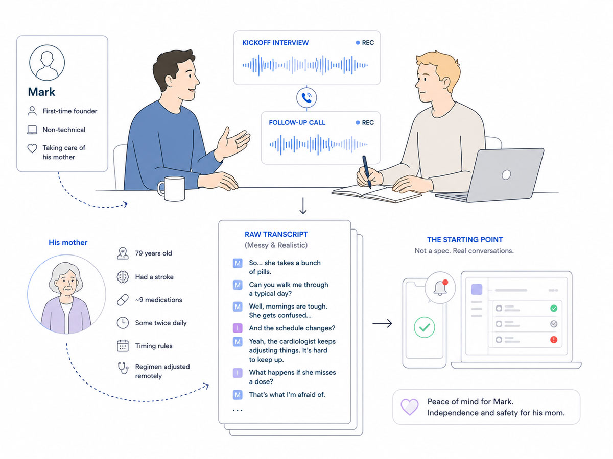
It began like a real engagement: a fictional founder, a messy kickoff call, and the transcript everything was built from.
Before any screen, the project moved through five agents, one role each. Each one pulls only the inputs it was built to use, does its part, and hands its output to the next. And if an expected input is not there, the agent falls back to the raw source material and works from that, rather than stalling.
Here is what each produced and, more importantly, what it surfaced.
Consolidating the brief
A first agent produced the consolidated brief: Mark’s scattered story reorganized and hierarchized, the explicit needs separated from the implicit ones, the open questions worth sending back. It also flagged the tension that would shape the entire product: the most safety-critical signal, did she take the blood thinner, depends on the least reliable one, a tap on a screen.
Researching the field (Discover)
The research agent produced the benchmark, the domain study and the research synthesis.
The most useful finding was uncomfortable: the reminder, the thing the client thought he was asking for, is a solved commodity. Every competitor does scheduled reminders with a tap to confirm. The real, unsolved problem sat underneath it, keeping a constantly changing regimen accurate from a distance, with a patient who cannot capture or report anything herself.
The domain raised the stakes. A regimen that keeps changing makes any fixed schedule wrong over time. A blood thinner leaves almost no margin for error. And designing for elderly users sets hard limits on text size and tap targets.
Two ideas from other fields stuck: alerts whose urgency controls both how loud they are and whether they escalate, and a reminder that keeps nagging until the dose is actually taken, not just swiped away.
Reframing the Problem (Define)
The define agent wrote the problem statement, the jobs to be done and the current journeys.
The reframe, in one line: how might a remote caregiver keep a low-tech parent’s frequently changing regimen accurate and verifiably followed, while the parent does almost nothing. The jobs confirmed the split. The caregiver’s real jobs are about certainty and peace of mind across distance, not reminders. The patient’s jobs are about the absence of effort and the absence of confusion, and about dignity, not feeling policed.
The current journey put the pain into focus: three days of phone tag with the cardiologist’s office to confirm one new blood-thinner dose, and a double dose discovered two weeks late, by accident, through a pharmacy refill call.
Exploring Directions (Ideate)
The ideation agent diverged into several distinct concept directions and converged on one:
All the complexity lives in a caregiver cockpit, while the patient sees almost nothing, a single card and a single button. The urgency of every alert is set per medication by the caregiver. And entering or changing a regimen is treated as a friendly manual task, not something the app pretends to automate.
Planning the Architecture
The architecture agent turned that into a skeleton, the user flows, the sitemap and the feature list.
The structure is the asymmetry made concrete: three faces over one shared model, organized per patient. A full tabbed app for the caregiver, a single state-driven screen for the patient, and a read-only subset for an external contact (e.g. a family member).
Building the screens (Prototype)
Then a final agent built the first screens of each section, directly in the real iOS 26 design system, native components from the start rather than generic mockups. How that phase went, where it failed and the guardrails it took to fix it, is in the pipeline story.
What follows is the product itself, screen by screen, and how each part answers something the research surfaced.
I am text block. Click edit button to change this text. Lorem ipsum dolor sit amet, consectetur adipiscing elit. Ut elit tellus, luctus nec ullamcorper mattis, pulvinar dapibus leo.
The Caregiver’s Cockpit
The caregiver side is the cockpit: a full iOS app that carries every bit of complexity, precisely so the patient’s side can carry almost none. Everything below lives here, building patients and regimens, watching adherence, handling alerts and refills, and setting up the people who get notified when something goes wrong.
Setting up a patient
The caregiver is the only real admin, and the first thing he does is create a patient. I designed this for more than one patient from the start: a switcher at the top lets a single caregiver manage, say, a mother and a father, each with their own regimen, alert history and care circle contacts.
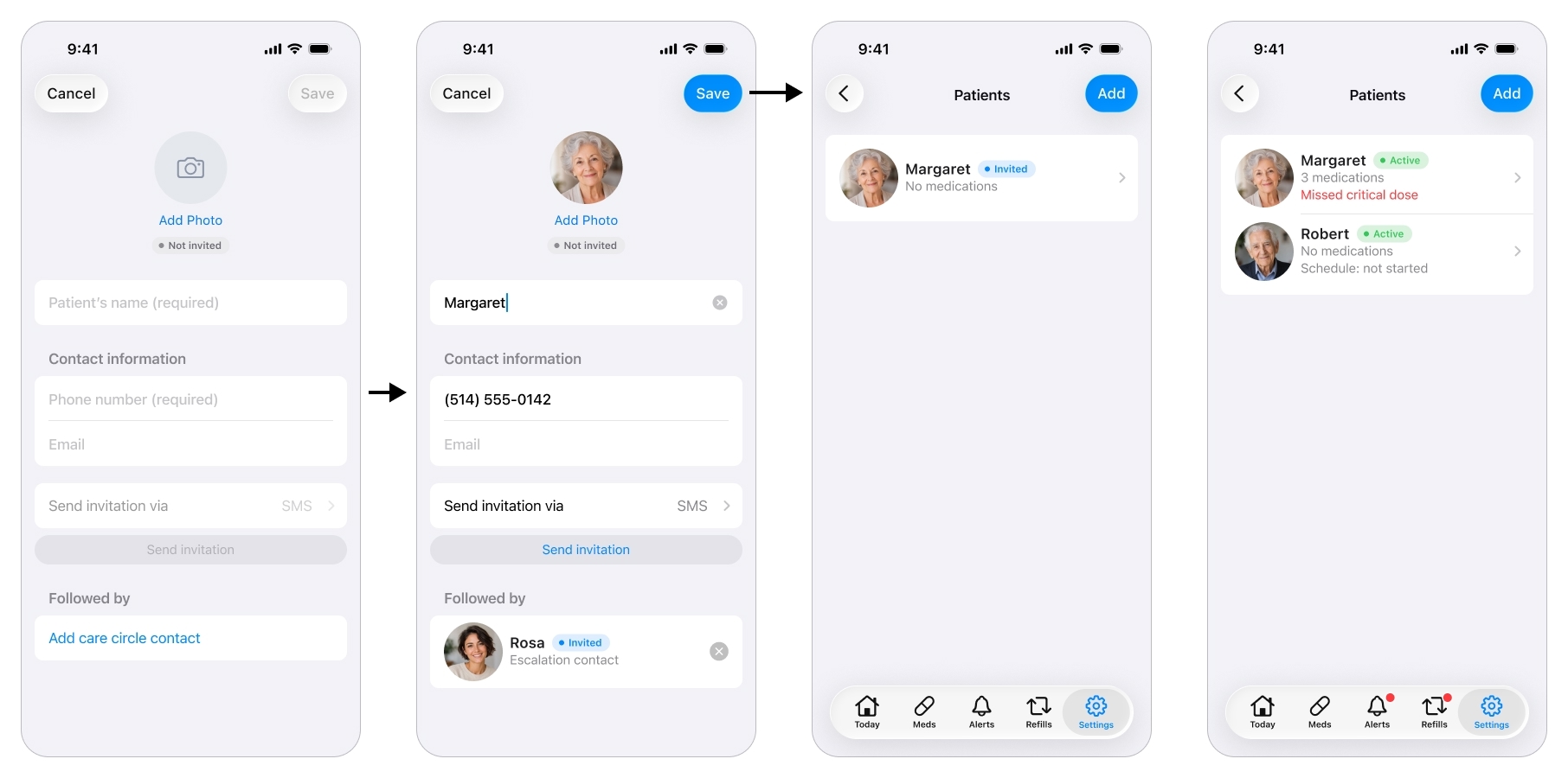
Setup starts with creating the patient the caregiver will manage.
An honest note on scope. The original brief was about one patient. I pulled multi-patient into the design on purpose, because hard-coding a single patient is exactly the shortcut that forces a painful rebuild the day a caregiver has two parents to look after. It cost almost nothing to design now and it future-proofs the whole structure.
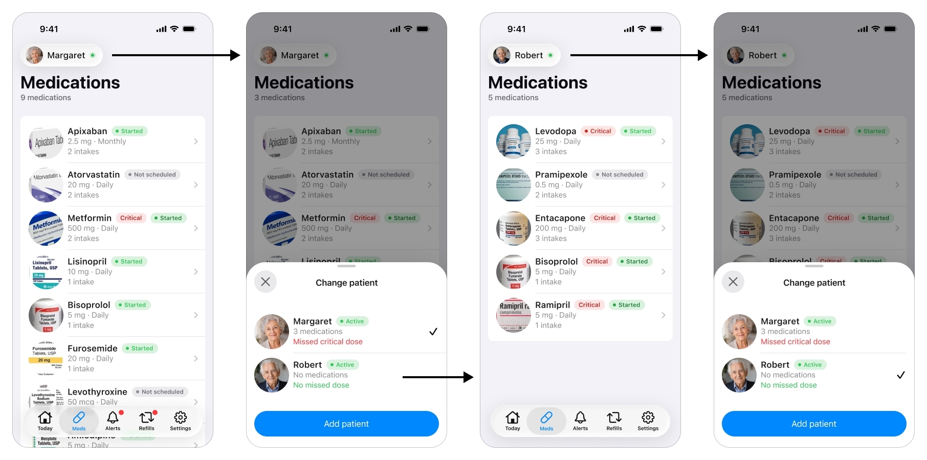
One caregiver, several patients: the switcher at the top re-scopes the entire app, Today, Alerts, and Refills, to whichever patient is selected, not just the medication list.
Building the Regimen
This is where the product is won or lost, and it maps straight to one of the challenges the research found: getting a complex, changing regimen in accurately, by hand, from a distance.
A medication is far more than a name and a time. Each one carries a strength, a form (tablet, capsule, liquid, drops, a puff), a criticality level, a takeable window, and how-to-take instructions. Every one of those fields exists because the research demanded it: clinical timing rules like on an empty stomach, an elderly patient who needs to be told how to take each pill, and the blood-thinner-vs-vitamin distinction that has to drive everything downstream.
Filling in a Medication
There is a lot of important information to enter for one medication, so the app fills most of it in.
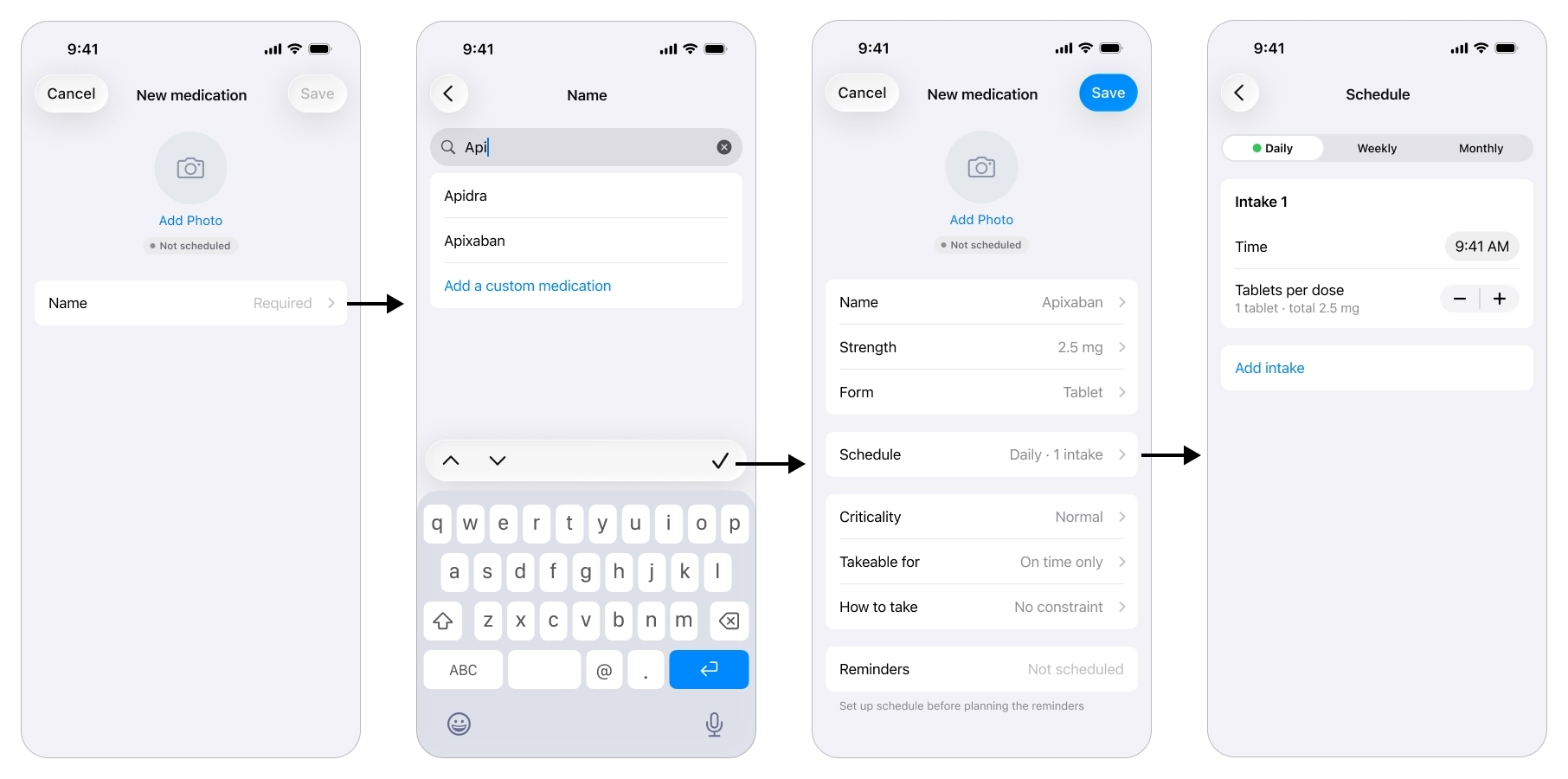
Type a name and the app prefills the medication's details, turning a clinical form into a few taps.
The caregiver starts with the name, picks it from a list, and the moment he does the app prefills sensible defaults, the strength, the form, the how-to-take instruction, pulled from a free drug database I came across during the research phase. Most of the record is populated before he edits a single field, which turns a tedious clinical form into a few taps.
Scheduling Intakes
Scheduling is its own screen, and this is where I let the design move, deliberately, away from the first version.
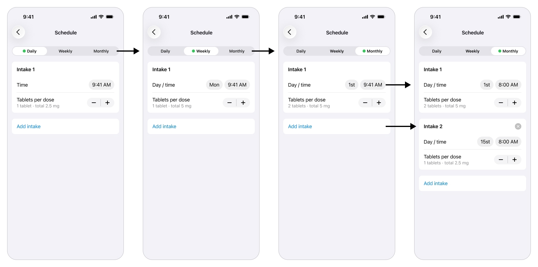
Each intake is one occurrence of the schedule, with its own time and dose, so a regimen that varies by day or date stays flexible and accurate.
Early on the schedule was rigid, with the dose locked on a different screen. Real regimens are not like that. A medication can be two tablets on the 1st of the month and one on the 15th, and a dose can vary by day of the week. So I rebuilt the flow around an intake: one occurrence of the schedule, with its own time (or day and time) and its own quantity. Daily, weekly or monthly, add or remove intakes, each one able to carry a different amount.
Setting Criticality
The caregiver marks each medication critical or normal. A critical medication earns an intrusive, hard-to-miss alert on both sides, delivered as an iOS Critical Alert, the notification type that pierces silent mode and Focus, along with an escalation path. A normal one gets a regular notification.
This came straight from the brief’s central tension and from an out-of-domain pattern: let one urgency flag decide both how loud the system is and how far it escalates.
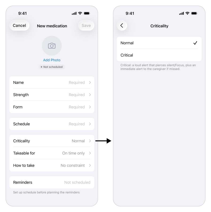
One setting, criticality, decides how hard the system pushes when a dose is missed.
Tracking Adherence
Once the regimen is set and the schedule has started, the cockpit opens on a single glanceable answer to the question that used to drive the daily phone calls: “did she take it?”.
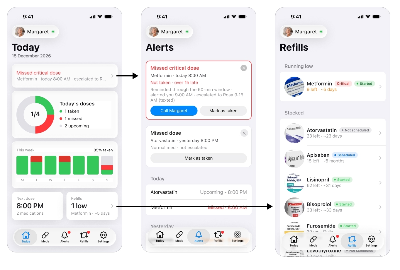
The glanceable answer that replaces the daily phone calls: did she take it?
The today view shows, per patient, what has been taken, what is still pending, and any active alert, with the fuller history a tap away. This is the feature that replaces calling three times a day, the caregiver looks instead of interrogates, which is peace of mind across distance made concrete.
Alerts and Escalations
This is the caregiver’s half of the safety net, and it is a core part of the app. Reminders and alerts are tiered by the criticality set earlier. A normal miss is logged quietly. A missed critical dose runs a ladder: the patient is re-nagged a few times, and if the dose is still not taken, the caregiver gets the iOS Critical Alert that pierces silent mode and Focus.
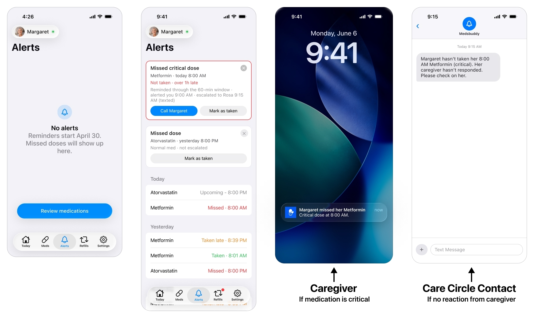
A missed critical dose runs a ladder: re-nag the patient, alert the caregiver, then escalate to the care circle.
Because even that can fail, a phone is off, silenced or offline, the alert escalates to the care circle (see below): if the caregiver does not acknowledge a missed critical dose within a set window, it reaches a designated escalation contact he set up in the app’s settings. This is the fallback the research insisted on, the most important alert depends on the least reliable channel, so it cannot rest on a single notification landing on a single phone.
The Care Circle
Around the patient is a care circle, and the caregiver builds it in the Settings.
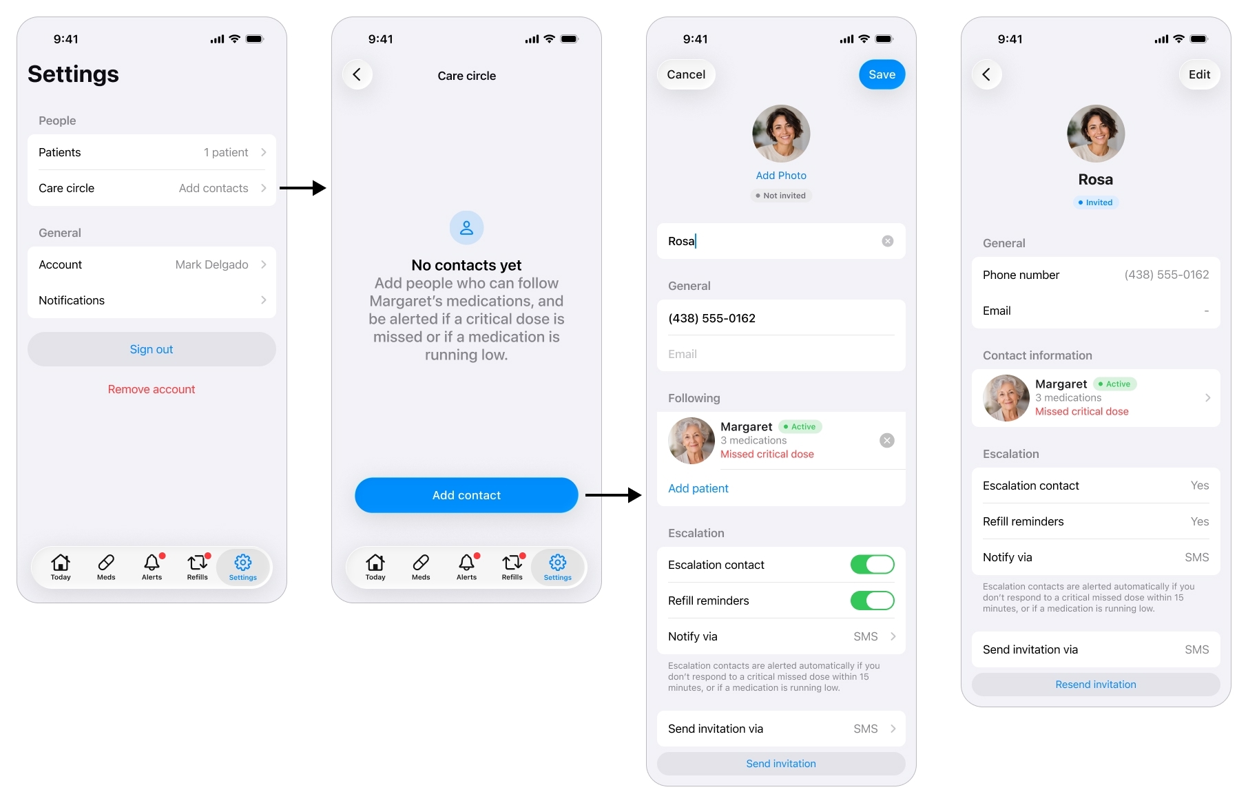
The people around the patient: who gets called when the caregiver can't be reached, and who can simply keep an eye out.
He can add several people, not just one, and give each a role: an escalation contact who is reached when the caregiver cannot be, a read-only viewer such as a sibling who can follow along, or both. A contact can also be set to receive refill warnings, so someone nearer the patient knows when a medication is running low.
The read-only view is deliberately thin: the same adherence dashboard the caregiver sees, with every edit control removed. A relative keeps an eye out without being able to touch the regimen or break the caregiver’s setup. That answers a job the research surfaced, letting family share the load without stepping on each other.
Planning Refills
A smaller piece, but it removes a real fear from the journey: running out of a medication over a weekend. Each medication tracks how many units come in a box and how many are left, and the app counts down from consumption (based on the patient’s reported intakes) to flag what is running low before it becomes a crisis.
Few screens, low effort, and one less thing for the caregiver to carry in his head. It is a small contribution to the same goal as everything else here: peace of mind.
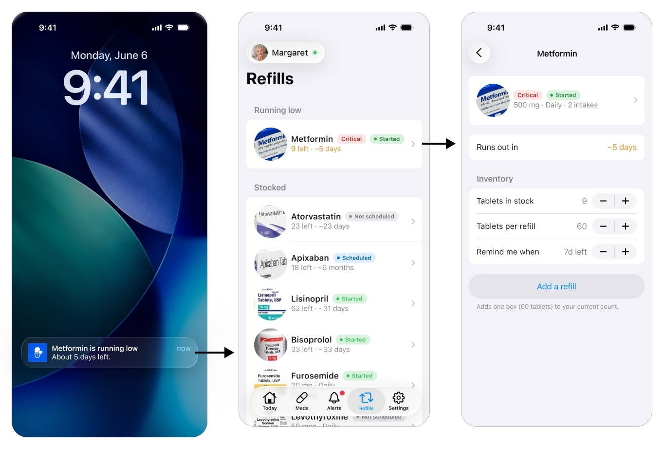
A quiet safeguard against running out over a weekend.
The Patient’s Single Screen
If the cockpit is everything, the patient app is almost nothing, on purpose. It is a single screen that changes state, with no account, no menus, no settings, nothing to learn. That restraint is the one non-negotiable rule of the whole product.
Activating the patient
There is one setup moment on the patient side, and it is the single step where an elderly patient may genuinely need a hand. The caregiver sends an invite by text message. The app is installed on the patient’s phone from that link, and once it is, opening it activates the device against the patient account the caregiver already built, so it lands straight on her medications. No account to create, no password, no settings to choose, everything was prepared in the cockpit.
I treat the install itself as the one assisted step: a relative or the visiting home aide helps once, rather than pretending a post-stroke patient installs and configures an app alone.
What the patient sees
It starts with a notification. The patient, Margaret in this example, never goes looking for the app: a reminder brings her to it at dose time. For a medication the caregiver marked critical, that reminder is delivered as an iOS Critical Alert, so it pierces silent mode and Focus instead of waiting politely to be noticed. Tapping it opens the one screen, which moves through a few states from there.
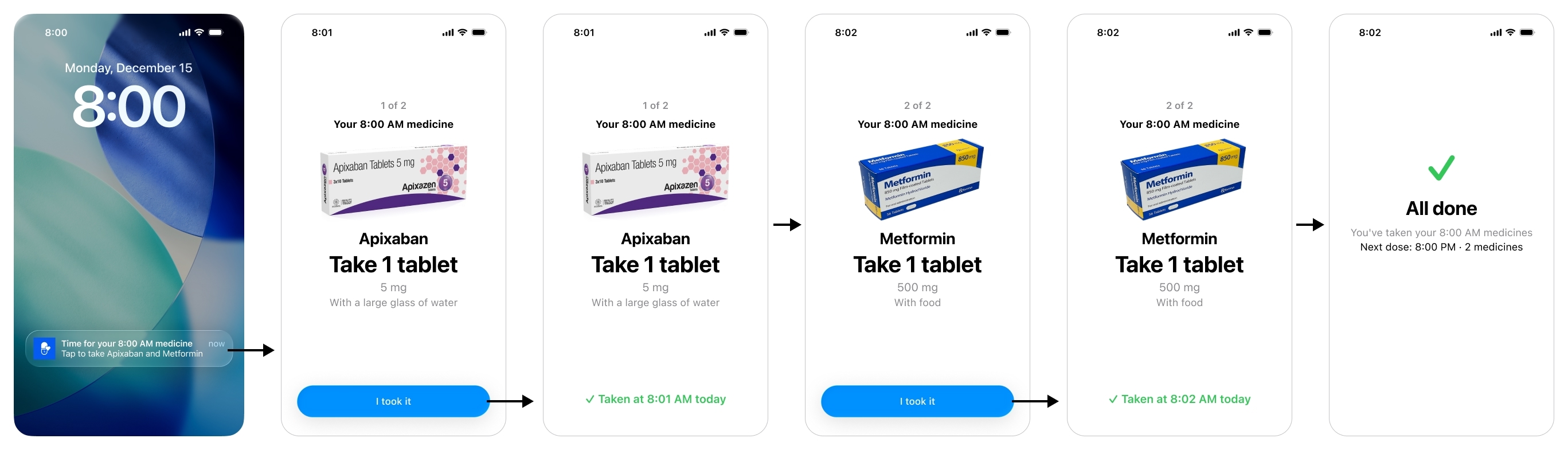
The patient's whole app is one screen that changes state, due, taken, all done, with nothing to learn.
When a dose is due, the patient sees a card per medication: a large photo of the pill, its name, how to take it, and one big Confirm. One tap.
The moment she confirms, the card reads Taken at a given time today. That single state is the product’s answer to the scariest event in the research, the double dose: reopen the app and it shows the dose is already done, instead of inviting a second one.
When nothing is due, the screen rests on All done, with the next dose and its time, just enough to settle the anxiety of not knowing what comes next.
If the takeable window (set by the caregiver in the Meds section) passes before the patient acts, the screen does not soften, it stops her. It shows the medication and, in large red type, “Don’t take it now”, with “It’s past the safe time” underneath. The intent is not to nag her into a late dose, it is to actively prevent a mistimed one and hand the problem to the caregiver. The dose is logged as missed, which is what triggers the alert on the caregiver’s side.
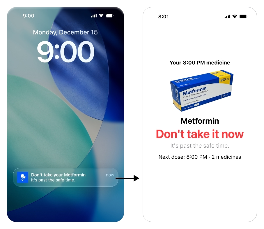
Past the safe time, the screen does not nag her to catch up, it stops her.
The honest limit: a tap cannot prove a swallow, and a truly silent double dose, taken with no tap at all, still cannot be caught in software. The brief accepted that trade, simple over perfectly accurate, because anything more would have cost the patient the simplicity that is the entire point of her side.
The discipline of saying no
The hardest design work on this side was deciding what to leave out. A few features were tempting, and I deliberately kept them off the patient screen. A “your regimen changed” announcement, for instance: her screen already shows the current dose because it is derived live from the cockpit, so a change alert would only add confusion and questions she cannot answer.
Or a calendar of upcoming doses: genuinely useful for the caregiver, but for a post-stroke patient it is exactly the kind of thing she should never have to navigate. Both would have broken the one rule that cannot bend: on the patient side, restraint is the feature.
Conclusion
The shape of the product is the shape of the problem. Everything hard is on the caregiver, almost nothing is on the patient, and a single per-medication setting, criticality, decides how hard the system pushes when something goes wrong.
It is honest about its edges. Remote change-capture is still manual in v1, the app makes it friendly, it does not pretend to automate it. A silent double dose can still slip through. Those are not oversights, they are the limits the research found, and the design chose to be upfront about them rather than paper over them. A v2 would go after exactly those two open problems, getting regimen changes in automatically and making confirmation harder to fake, plus Android.
And all of this, the research, the reasoning, and the starting point for the screens I then built out myself, came from an AI design pipeline I made for this project. That is its own story.