Role
Product Designer (self-initiated)
Project
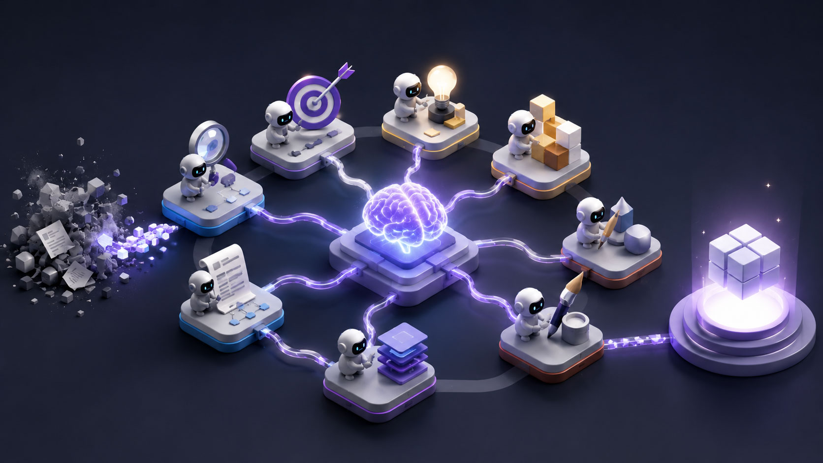
An AI agent pipeline
Duration
~3 weeks
Context
Background
I wanted to find out how far a senior designer can be augmented by Al. So I built a pipeline of agents mapped to the phases of product design, and stress tested it on a real app concept, from brief to screens.
The honest verdict up front: AI worked less as an autopilot than as a tireless thinking partner. It compressed the upstream phases, research, strategy, architecture, enormously and sharpened my decisions. But the screen craft and the judgment stayed mine, and the whole thing only stayed on track inside a system I had to build around it.
”I wanted to find out how far a senior designer can be augmented by AI. So I built a pipeline of agents mapped to the phases of product design.
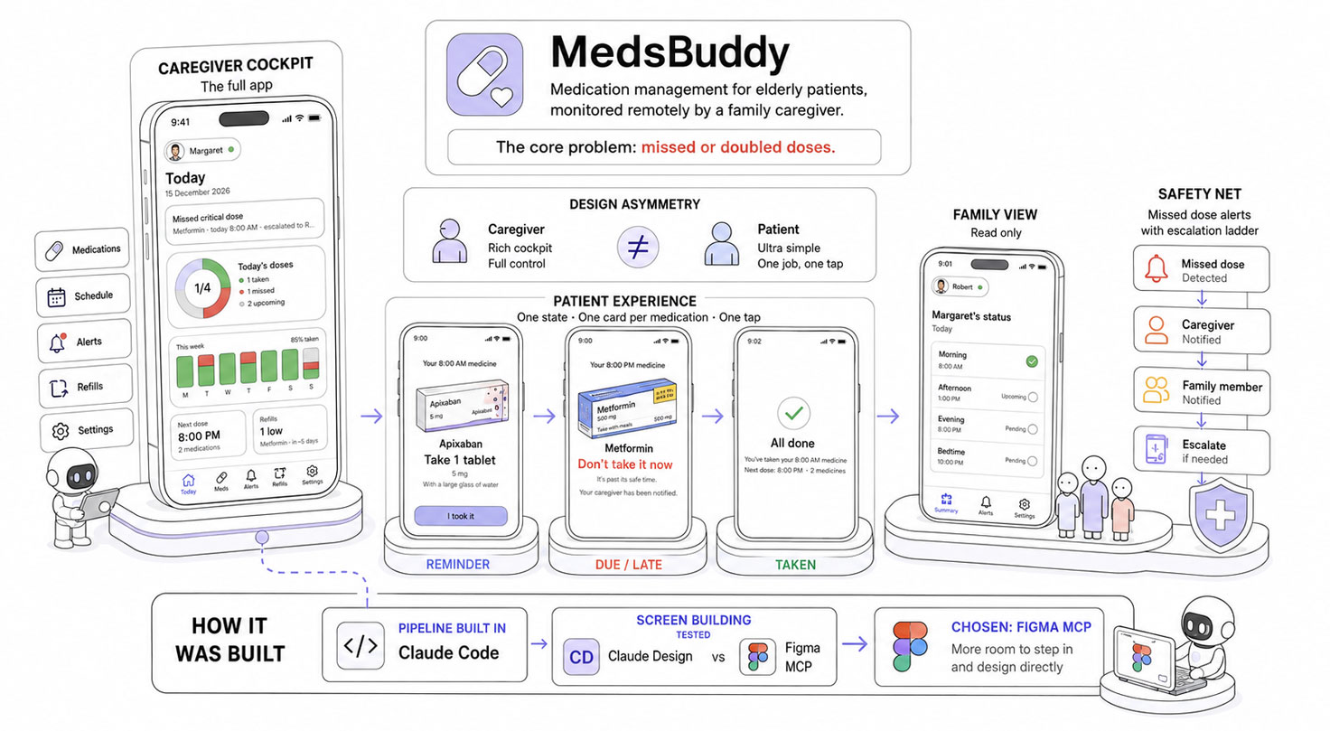
MedsBuddy: a caregiver cockpit, a simple patient experience, and a safety net for missed doses.
The Project
The app I designed through the pipeline is MedsBuddy, a medication management app for elderly patients monitored remotely by a family caregiver. The core problem is real and dangerous: missed or doubled doses. The design hinges on an asymmetry: a rich caregiver cockpit (the full app) versus an ultra simple patient screen (a single state driven view: a reminder, one card per medication, one tap to confirm), plus a read only view for other family members, and a safety net of missed dose alerts with an escalation ladder.
Read the full app story in the Medsbuddy page; here it is just the context for what the pipeline was producing.
I built the pipeline itself in Claude Code. For the screen-building phase, I tested Claude Design against the Figma MCP and chose the Figma MCP, because it gave me more room to step into the file and design directly, rather than working only through prompts.
The System
I built one agent per role of a product design team, mapped to the double diamond (the design model where you first explore and frame the problem, then explore and deliver the solution).
Every agent runs on Claude Opus 4.8.
Each agent is a specialist with a defined mission, explicit inputs and outputs, and the discipline of its phase. They hand off through a shared repository, split into Source (the immutable raw material) and Generated (the agents’ outputs, tracked by a living index).
The handoff is deliberately flexible: an agent pulls what it needs from Source, so you can start at any phase, skip whatever is not relevant and go back. A set of cross cutting skills (shared conventions, plus reusable abilities like deep reading a design system or learning a platform’s guidelines) is available to every agent.
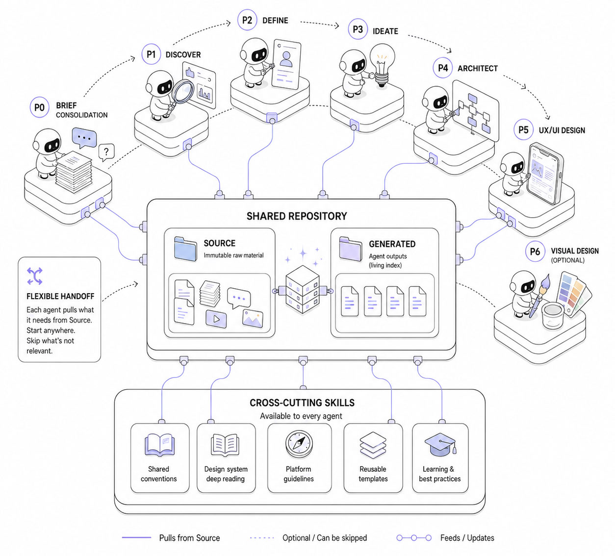
A modular AI design system where every agent knows its role, shares context, and hands off work through a single source of truth.
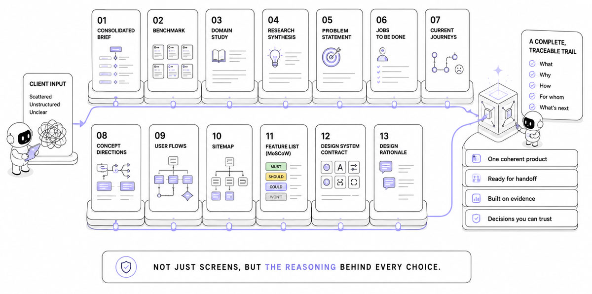
P0 – Brief Consolidation (the brief lead):
Turns scattered, messy client material (documents, transcripts, any language) into a structured, hierarchized brief plus triaged clarification questions, and decodes the domain jargon. Synthesizing, not summarizing.
→ Delivers: a clean consolidated brief, the scattered input reorganized and hierarchized, with the open questions worth sending back to the client.
P1 – Discover (the researcher)
Builds the knowledge base, modularly: a three-circle competitive analysis covering direct competitors, adjacent players, and cross-domain analogues, with sourced real screenshots, deep domain immersion, optional interview synthesis, and an audit of an existing product. Senior value is pattern synthesis, not collection.
→ Delivers: a comparative analysis of the interaction patterns worth reusing and the ones to avoid, supported by real screenshots; a domain study covering the field’s vocabulary, standards, and constraints; and a short executive synthesis that feeds the next phase.
P2 – Define (the synthesizer)
Reframes the problem: who, what job, the client’s stated problem versus the real one the research supports, and why they differ, evidence backed.
→ Delivers: a problem statement, the reframed problem with the evidence behind it, plus personas and jobs to be done when the project calls for them.
P3 – Ideate (the concept lead)
Diverges into several genuinely distinct directions (different bets, not variants), then helps converge with a decision grid.
→ Delivers: a set of genuinely distinct concept directions, and the chosen one with the reasoning for picking it over the others.
P4 – Architect (the IA and flows lead)
Builds the navigable skeleton: user flows with branches and states, an information architecture with one face per actor, and a MoSCoW v1 scope, covering all actors and the full lifecycle.
→ Delivers: the user flows, a sitemap, and a feature list, that is, how the product is navigated, where everything lives, and what makes the v1 cut.
P5 – Prototype (UX/UI designer)
Connected to Figma through the Figma MCP, it translates the flows into screens with real content, built directly from the platform’s real components in their native appearance.
→ Delivers: the screens themselves (in Figma), a running log of every design decision, and a design system contract, the single source of truth for the tokens, components, and spacing.
P6 – Visual Design (the stylist)
Applies the art direction to the validated P5 screens, mostly by recoloring real components rather than redrawing them. Skipped when the client already has a brand design system.
→ Delivers: a design system and the high fidelity screens, the validated P5 screens dressed in the art direction. (Not reached in this project, we stopped at P5.)
How it actually went
From what worked best down to where it broke, then what I changed.
What worked, what broke, and the guardrails that turned the pipeline into a reusable AI-augmented design process.
The wins
Speed, above all upstream
The research, strategy, and architecture phases that normally take weeks were done in days. End to end the project took about three weeks; without the pipeline I estimate five to six, and almost the entire difference is upstream. These are honest estimates, not stopwatch data.
Research was the strongest phase
A benchmark spanning not just direct competitors but adjacent apps that solve connected problems, a domain immersion on medication adherence, drug databases. Genuinely useful, and more thorough than I would have done on my own. This was the real win.
A reusable trail, and a reusable machine
Everything the pipeline produced is a client ready artifact: brief, benchmark, domain study, problem statement, jobs to be done, flows, sitemap, feature list, and a running design decision log. That kind of traceability is rare for a solo designer and adds real value for a client.
And the pipeline itself is reusable: I keep it and refine it, so the next project starts with the machine already built instead of from scratch.
A thinking partner
Capturing and challenging decisions worked well: the AI was a tireless colleague to think out loud with, which often got me to a solution faster than working alone, and it kept reminding me of iOS conventions. One honest caveat: it tends to agree with me, even when I am ultimately wrong. It does not push back enough.
Consistent example data
A single fixture holds the sample data (patients, medications, schedules, statuses) in one place. I set it up early, so every screen pulls the same names and values and nothing drifts from one screen to the next.
A fast start on screens
On the screens themselves, the value was kickstarting each one quickly. The development and finishing were mine (see below), but a populated starting point beats a blank canvas.
It was also a real asset for diagrams and data visualizations: charts built straight from the fixture data, so the figures shown on screen stayed coherent with the rest of the project.
The honest failures
None of that means it ran smoothly. The pipeline broke in real, instructive ways, and the worst of it was concentrated in one place: turning flows into actual screens. Here is what went wrong, and what it cost.
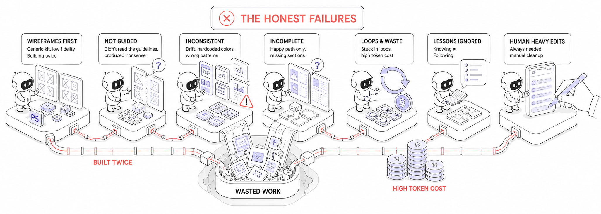
Where the pipeline broke: the moment AI speed met real design complexity.
The wireframe trap
The biggest failure was the P5 agent (UX/UI), and it started with how I had designed the pipeline itself. The initial model had P5 produce low fidelity wireframes from a generic kit, then a later agent (P6) rebuild everything in high fidelity with the iOS design system.
Three things were wrong with that. The generic kit was only vaguely iOS-like, so instead of guiding the agent it confused it. Building every screen twice, once in lo-fi then again in hi-fi, burned tokens and time the lo-fi pass never earned back. And more fundamentally, generating wireframes through an agent defeats their whole purpose: a wireframe is meant to be a fast, throwaway sketch, but here every screen meant prompting, waiting for the model to reason, watching it drive the Figma MCP, and only then getting a result, slowly and at a real token cost. The spontaneity that makes wireframing useful was gone.
No guardrails
The deeper problem was that the P5 agent had no guardrails. It had not read Apple’s Human Interface Guidelines or the iOS 26 design system, so it had no real grasp of the native UI patterns needed to keep the flows coherent, and its translation of the wireframes into the iOS design system was a mess. It invented patterns that did not follow iOS conventions. Components and dimensions drifted from screen to screen, and it hardcoded inconsistent colors instead of using design tokens, forcing hours of manual re standardization. It repeatedly covered only the happy path and forgot whole sections. It got stuck in loops, like blindly guessing icon codepoints.
And lessons written into the agent’s skills kept getting repeated anyway: knowing a rule is not the same as following it. My honest admission: I leaned too hard on the AI in this phase, which cost time and tokens. The screens always needed heavy editing from me, which is why I now use this agent to kickstart, not to finish.
The fix followed from all of this: skip the low fidelity pass entirely and have a single P5 agent design straight in real, native iOS 26 components. I had the AI rewrite the two agents, and the P6 visual agent was cut down to optional recoloring. But changing the pipeline was not enough on its own; the agent still needed hard constraints, which is exactly what the guardrails below are. A lot of work was thrown away to get there.
None of this is locked, and that is the point. If I want to wireframe a flow by hand first, P5 can still take my own sketches in as Source and build from them, so I keep the option without paying for the agent to draw them. I have not settled exactly where P5 sits in the process yet, and I do not have to: any agent can change role, or be split, without breaking the pipeline, because they only ever talk through the shared repository. The failure that cost me the most also showed me the system was built to absorb that kind of change.
Token cost on trivial tasks
Some genuinely simple tasks, like finding an icon and placing it into a component, burned a disproportionate number of tokens relative to how simple they were. In practice I often had to interrupt the agent mid screen and make the change myself, because the back and forth cost more, in tokens and time, than the change was worth.
The learning I outsourced
Early on I leaned on the AI for the upstream work, the research most of all, more than I should have. There is a hidden cost to that. The research phase is normally where a designer goes digging, reading and scanning, and that effort is exactly what makes the domain stick: you slowly become a kind of micro-expert in the field you are designing for, and the knowledge compounds as the project moves on.
By letting the AI gather and synthesize for me, I reached the screen phase knowing the domain less deeply than if I had done that digging myself. The research output was genuinely strong, but my own grasp of it was thinner. It is a subtle, real danger of pushing AI too far upstream: you keep the deliverables and quietly lose the learning.
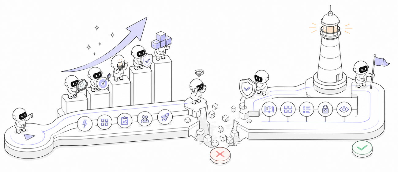
The guardrails
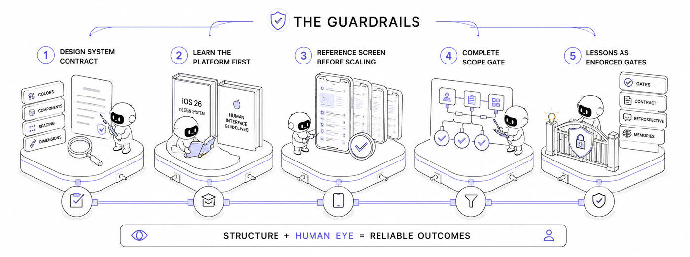
The guardrails that kept the AI useful: structure, validation, and the human eye.
The failures pushed me to wrap structure around the AI. The pieces that actually worked:
A design system contract
I asked Claude to extract a single source of truth from the iOS 26 kit and the official Apple’s Human Interface Guidelines, the exact color tokens, the components and their keys, the spacing conventions, the canonical dimensions, written and referenced before building any screen, instead of letting the AI improvise each value; this contract is what actually cut the errors.
It is also the reference for verification: before closing a screen the P5 agent diffs the real values on the canvas (spacings, colors bound to a token versus hardcoded, real kit components versus custom look alikes, dimensions) against the contract, because a screenshot hides drift but the numbers do not.
Learn the platform first
The agent now reads the iOS 26 design system and Apple’s Human Interface Guidelines before it designs, instead of guessing the conventions.
A reference screen before scaling
One screen was validated as the standard, then every other screen was built from it, so the conventions were locked before mass production rather than discovered midway.
A complete scope gate
Before building a screen, the agent must derive every state, role, and section from the flows and the example data, instead of designing only the happy path. This came straight from it forgetting whole sections.
Lessons as enforced gates
I asked Claude to rewrite the screen agent so the recurring failures became blocking gates rather than passive advice, kept a reusable contract template for future projects and an honest running retrospective of the collaboration, saving the most stubborn lessons as memories the agent loads every session.
The clearest finding of the whole project: the only reliable guardrails are structure plus the human eye. Writing a lesson down in the agent’s skills does not stop the AI from repeating it; a gate does.
Results
The screens
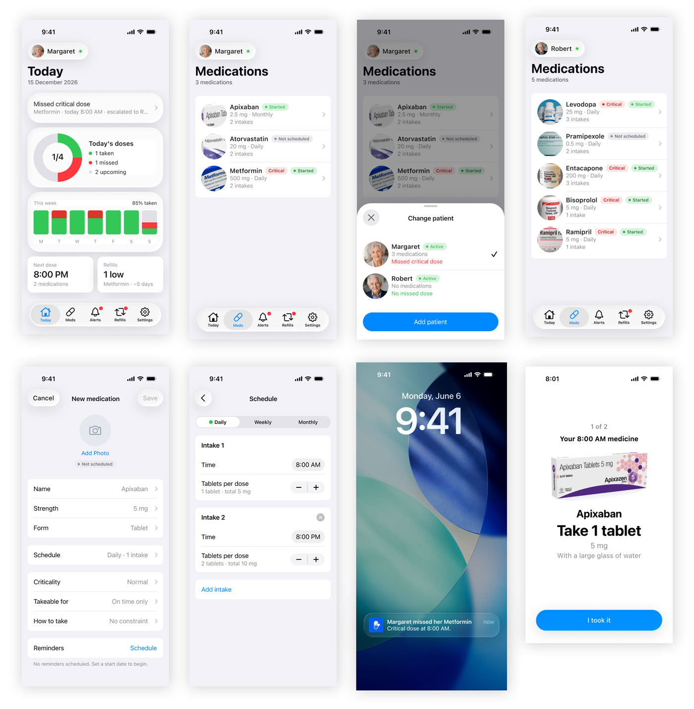
A complete native iOS screen set, designed as one consistent product.
The screens shown here are a complete, coherent set of native iOS 26 designs, finished to a pixel perfect standard, covering the whole product: adding a medication (dose, schedule, intake instructions, criticality), creating a patient and inviting them, adding a care circle contact, the caregiver cockpit (today, medications, alerts, refills, settings), and the patient side dose cards across their states (reminder, due, taken, all done).
But to be clear about who did what: the AI did not design all of this. It kickstarted each section by designing the first screen, a populated starting point. From there the work was mine. I designed the essential of the flows, and I reworked and refined the screens heavily to reach this level. The pipeline gave me a head start, not a finished product.
Because every screen draws from the same components, tokens, and spacing, the Medsbuddy app reads as one consistent product rather than a pile of mockups.
The documentation
Beyond the screens: a complete trail of evidence, decisions, and rationale ready for handoff.
Beyond the screens, the pipeline leaves the client a complete, traceable trail of documents, the kind a consultancy bills as discovery and strategy. Each one reads on its own:
Research (Discover)
- The consolidated brief: the client’s scattered input reorganized into one structured, hierarchized brief, with the explicit separated from the implicit and the open questions to resolve.
- The benchmark: direct competitors, adjacent apps, and cross domain analogues, with real screenshots and the interaction patterns worth reusing or avoiding.
- The domain study: the medication adherence field in plain terms, its vocabulary, standards, accessibility constraints, and state of the art.
- The research synthesis: a short executive summary of the key insights, the patterns to keep, and the tensions to resolve.
Strategy (Define and Ideate)
- The problem statement: the reframed problem (who, what job, the real problem versus the stated one), with the evidence behind the reframe.
- The jobs to be done: who we design for, and what they are actually trying to accomplish.
- The current journeys: how people cope today without the product, and where it hurts.
- The concept directions: the distinct approaches that were explored, and the chosen one with the reasoning for picking it over the others.
Architecture (Architect)
- The user flows: every key task step by step, including branches, errors, and edge states.
- The sitemap: the information architecture, where everything lives and how it is navigated, with one view per type of user.
- The feature list (MoSCoW): what makes the v1 and what is deferred, and why.
Design (UX/UI)
- The design system contract: the tokens, components, spacing, and dimensions the screens are built on, ready for a developer handoff.
- The design decision log: a running log of every screen decision and the reasoning behind it.
Taken together, these explain not just what the app is, but why every choice was made, which is exactly what tends to get lost in a handoff.
Conclusion
he biggest surprise was where the leverage actually lived. Not in prompting, and not in the screens, those stayed hands-on and full of back and forth. It lived in orchestration: designing the agents, the pipeline, the contracts, and the gates that keep the whole thing honest.
The other half was the dialogue. Used as a colleague to think out loud with, the AI created a mirror effect that got me to solutions faster than I would have alone. And once the guardrails were properly set, it kept reminding me of iOS best practices along the way, yet, the judgment stayed mine.
For now, with what I experimented, the rule of thumb I came away with: the more screens I asked it to design at once, the more errors it made. AI can be a designer, but far from a perfect one: it’s like a fast, tireless junior that drifts without some guidance and a system.
The pipeline is not a finished artifact, it is a system that keeps improving. The flexible architecture lets each agent evolve on its own, both in the skills it follows and in the documents it produces, without disturbing the rest of the chain. I am refactoring several agents right now with the lessons this project taught me, so the next project starts from a sharper version of the machine.